Statistical Analysis of Performance Data Part 3 - Histograms
Published on 16 Nov 2011Tags #Average #Excel #Histogram #Statistics
So far, I have written about averages and correcting your data set. In both articles, I have stressed the importance of recognizing outliers and acting according to generally accepted methods. In this article, I will provide the means to identify outliers and their effect on a data set using histograms.
Introduction
A histogram is a very effective tool for analyzing a data set. It shows an aggregated representation of the values and provides an impression of the distribution of the values. Take a look at the following histogram.
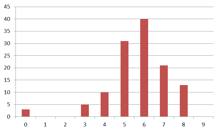
In the image above, values have been counted based on their size displayed on the horizontal axis. From a histogram, it is really easy to extract some important information. In this case, the smallest value is greater than or equal to zero and the largest value is smaller than 9. And apparently, most values fall into the range between 3 and 8. Therefore, the values in the first bucket are outliers. A histogram can also help you determine whether your data is distributed normally - which is an important prerequisite for many methods presented in this series.
Mind that you cannot easily read the average value from a histogram. But in this case, the human eye is able to spot that it is somewhere between 5 and 6. Still, don’t rely on your observational skills but calculate the average.
Building a Histogram
The intervals on the x axis are also called buckets because values are sorted into them based on their size. The number of values in each bucket is charted in vertical bars. There are two methods for setting up your buckets:
-
The easiest way of creating a histogram is deciding how many buckets you require and calculate the width from the minimum and maximum values. Although this approach results in a predetermined number of buckets, the intervals are rarely expressed by whole numbers.
BUCKET_SIZE = (MAXIMUM_VALUE - MINIMUM_VALUE) / BUCKET_COUNT
-
Alternatively, choose a bucket width beginning at a sensible value to include the minimum of your data set. This method produces a different number of buckets as you will have to use an ample number of buckets to include the maximum value.
Both methods are equally valid and the choice depends solely on your personal preference or the requirement in your analysis.
Assigning Values to Buckets
An intuitive way to assign values to buckets is to calculate the lower and upper bounds for all buckets. A simple comparison produces the corresponding bucket. Obviously, this approach has a runtime of O(n*m) for n values and m bucket - which means it takes more time to process all values for larger data sets and more buckets.
When building a histogram fully automated, it is much easier to treat the buckets as an array and calculate the bucket number for every value. This effectively reduces the runtime to O(n) because every value can be sorted into the correct bucket straight away. All you need is the bucket width and the lower bound of the first bucket (usually the minimum value in the data set). The bucket number is calculated by
FLOOR((CURRENT_VALUE – MINIMUM_VALUE) / BUCKET_SIZE).
Relative Frequency
Sometimes, a histogram is used to show the relative frequency of values instead of the actual occurrences. This is often more conclusive, e.g. when applying a truncated mean to your data set because the histogram quickly tell you what percentage to exclude from the bottom and the top of your data set.

Creating Histogram Using Excel
Excel offers a built-in function called FREQUENCY (German: HÄUFIGKEIT) for calculating histograms from a data set. Unfortunately, you need to specify the full list of buckets by their middle value. In addition, you need to execute the function again whenever your data changes. I was looking for a more comfortable way of creating histograms.
You’ll find an Excel file attached to this article demonstrating how to use Excel to calculate histograms from an arbitrary data set. The file contains three sheets:
- “Data” contains some sample data
- “Histogram” displays the histogram based on the sample data
- “Configuration” is used to set up where the data is read from and how buckets are organized
The sheet contains a few fields that require some explanation:
-
The first fields called “Data” references the data to be charted in a histogram. It consists of a typical reference in Excel but is missing the equal sign. Without the equal sign, Excel does not evaluate the reference. Only then can I use the Excel function
[DIREKT]to access the referenced data. By pointing this cell to any kind of data, the histogram adjusts to display those values.[<FILENAME>]<SHEET >!<COLUMN> - The field labeled “Bucket Count” is the second important parameter in the configuration sheet. It is used to calculate the bucket size from the minimum and maximum value of the referenced data set.
- Instead of specifying the bucket count, you can enter the bucket size in the field “User Bucket Count”. This cell takes precedence over the bucket size calculated from the bucket count. The effective bucket size is displayed below this field.
Below the configuration values, the configuration sheet contains a table listing all buckets with the corresponding value count and relative frequency. In case, you are deviating from the preset bucket count - by specifying a new bucket count or using a custom bucket size - you may need to manually adjust the number of rows in the table. Either delete excess rows or use auto fill to create more rows.
Download the Excel file here.
Generating Sample Data Using Excel
When familiarizing with statistical analysis, it is often helpful to operate on sample data. Do not get tempted to use the Excel built-in function RAND for this because it produces values from an equally distributed set - just like a dice would.
Better use some kind of other data available to you. I often use data from an Excel sheet in which I take notes how I have spent my time at work. For every task I create an entry with start time and duration. When I first charted this data in a histogram I noticed that the duration of all my entries is normally distributed.