Performance Monitoring Part 8 - Analyzing a Performance Monitor Database using Excel
Published on 02 Nov 2009Tags #Excel #Performance Monitor #Processor
In the last post of this series about performance monitoring, I have described how to use Windows Performance Monitor to log counter values into a SQL database. Now I’ll show you that Excel is a tremendous tool to quickly analyze the collected data.
Excel offers a feature called pivot tables. It allows some data mining either on a local data set contained in an Excel sheet or on a database which Excel is connected to. Therefore, this article describes how to create a connection to the database and create nifty charts using Excel.
Creating a Database Connection
First, the data needs to be pulled into Excel. Instead of pulling tables or the result of a query into a sheet, we will configure a data connection to display results. Duplicating data into Excel hardly makes sense because it unnecessarily bloats the file.
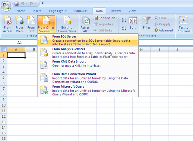
On the data tab, Excel offers several methods for reading data from different sources. We will use the “From SQL Server” button to create a connection to the Performance Monitor database.
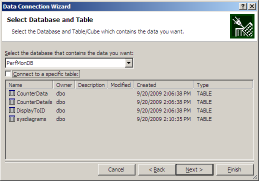
In the first dialog, enter the server name and click next. The following step of the wizard select the relevant database (in my case, it is called PerfMonDB) and uncheck the option to “Connect to a specific table” because we do not intend to use one of the tables. Then click “Next” and “Finish”.
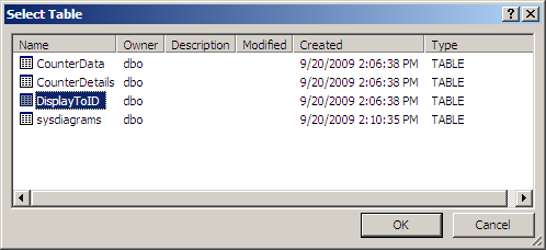
In the next dialog you will be asked to select a table. At this point, it is the selection you make is insignificant because we will use a SQL statement later on.
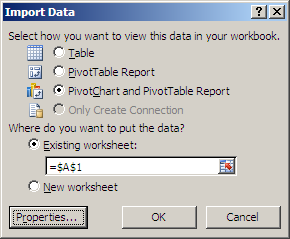
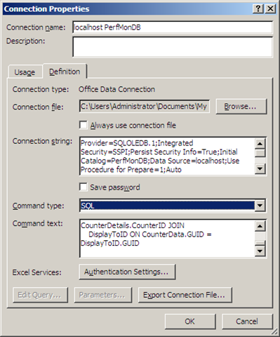
Before any data is inserted into your Excel sheet, the following dialog allows the data connection to be customized. Select “PivotChart and PivotTable Report” and click “Properties” to insert a custom SQL statement.
On the “Definition” tab of the new dialog, select “SQL” to be the “Command type” and page the following SQL statement into “Command text”. Then click “Ok”.
SELECT
    DisplayString, MachineName,
    ObjectName, CounterName, InstanceName,
    CounterDateTime, CounterValue
FROM
    CounterData JOIN
    CounterDetails ON CounterData.CounterID = CounterDetails.CounterID JOIN
    DisplayToID ON CounterData.GUID = DisplayToID.GUID
After closing the dialog, Excel may ask you to confirm the change of the connection definition. Please confirm this by clicking “Yes”.
Using the PivotChart
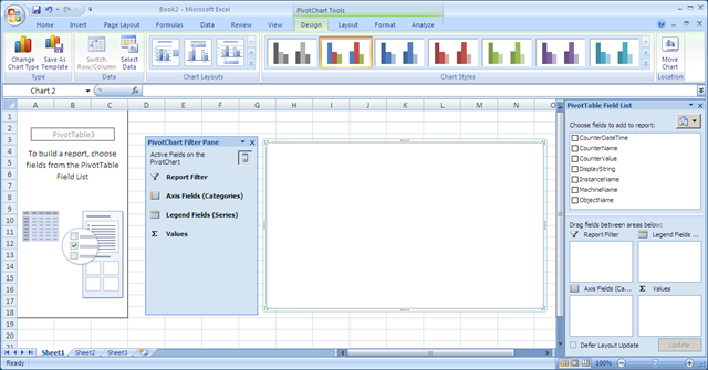
You have now created a blank PivotTable and PivotChart report with a direct connection to your Performance Monitor database. All this is achieved without pulling in the actual data from the database. You Excel sheet should look similar to the following screenshot.
The Excel window now contains several new elements: a PivotTable area on the left, a blank PivotChart accompanied with a filter pane in the middle and a PivotTable field list on the right. I will now expand on the PivotTable stuff but rather demonstrate how to use the PivotChart as a dashboard for analyzing the performance data contained in the database.
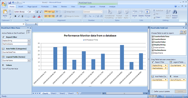
First, we will move the PivotChart to a separate sheet to have a well-arranged workspace. Right click on the blank PivotChart, select “Move Chart” and choose “New sheet” in the dialog. After attaching the filter pane to the right side of the window, I configured the PivotChart to analyze the performance database:
- Drag the DisplayString and MachineName fields to report filters
- Drag the CounterName to the legend fields
- Drag the CounterDataTime to the axis fields
- Drag the CounterValue to the values box
After some adjustments to the layout, I arrived at the PivotChart displayed in the screenshot below. Without much hassle, I am able to view the counter values from the database and create a nice visual representation.
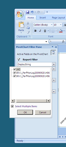
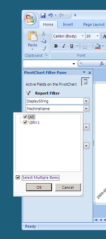
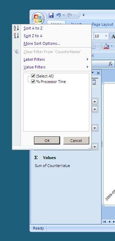
Using the filter pane allows you to filter which data is actually displayed in the PivotChart. If your Performance Monitor database contains several series of measurements for different machines, filtering focuses the PivotChart on the exact amount of data you intend to view from the database.
